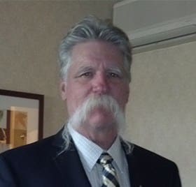
The Benefits of Mobile First Website Design

Responsive Website Design
Leave nothing to chance. Mobile phones and tablets are responsible for 56.74% of global internet usage. Is your business website Mobile Responsive

What is Responsive Website Design

Responsive website design is an approach which makes web pages render well on a variety of devices and screen sizes.

Mobile Responsive Website Design 101

Current website design practices are scrambling to keep up. Hence, the creation of responsive design. The WordPress CMS does this using media queries that allow the page to use different CSS style rules. Based on characteristics of the device the site is being displayed on using the width of the browser.

From a design perspective, responsive website design consists of four development principles. To work properly, all four need to be implemented:

Fluid Grids - Media Queries - Scaling - Flexible Images

FLUID GRIDS – A flexible grid-based layout is the cornerstone of responsive design. It uses relative sizing to fit the content to the device’s screen size. This is where CSS is used to position the content. Responsive design has moved away from the pixel-based approach because a pixel on one device could be eight pixels on another device.

To help explain this with a little more detail I suggest the Google Developers page for responsive design.

MEDIA QUERIES – Media queries, also known as breakpoints, are simple filters that can be applied to CSS styles. They make it easy to change styles based on the characteristics of the device rendering the content, including the display type, width, height, max-width, max-height, device-height, orientation, aspect ratio, and even resolution.

FLEXIBLE IMAGES AND MEDIA – This feature allows you to adapt images and other media to load differently, depending on the device, either by scaling or using the CSS overflow property.

SCALING IN CSS is relatively straightforward—the media element’s max width can be set at 100 percent, and the web browser will make the image shrink and expand depending on its container.

Here is a great tutorial on scaling your media with great examples.

DIY BONUS – Learn the fundamentals of responsive web design Create your own responsive web page that works well on any device. Join Google’s Pete LePage for a free course offered through Udacity Take the course

As a website owner, one of your fundamental concern should be on how to improve page load speed, because it is one the essential ingredient of a successful website. If you are looking for ways to reduce page load time.

While all the responsive design knowledge above may sound daunting, fear not. The WordPress community has had Responsive WordPress templates for a few years now. In fact, if you find any WP website that isn’t mobile responsive, email the webmaster and tell them 2005 wants its HTML template back. There are literally 1000’s of free responsive WordPress templates available and 1000’s more from Premium WP Developers for as little as $99.

Responsive WordPress templates Certified by SERP Sniper

Law Firm Website Design

Leave nothing to chance in today’s cutthroat business climate.  A well constructed local business website often makes the difference between success and failure. To comply with Googles “Mobile First” requirement we use Elementor Pro and WordPress to create Custom Responsive websites. 

In addition, Web SEO Houston optimizes all On Page SEO including layout, design, css and social media. 

Leave nothing to chance. Mobile phones and tablets are responsible for 56.74% of global internet usage. Is your business website #MobileResponsive

Share this post with your friends

Scroll to Top